
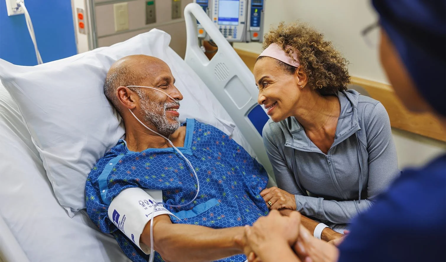

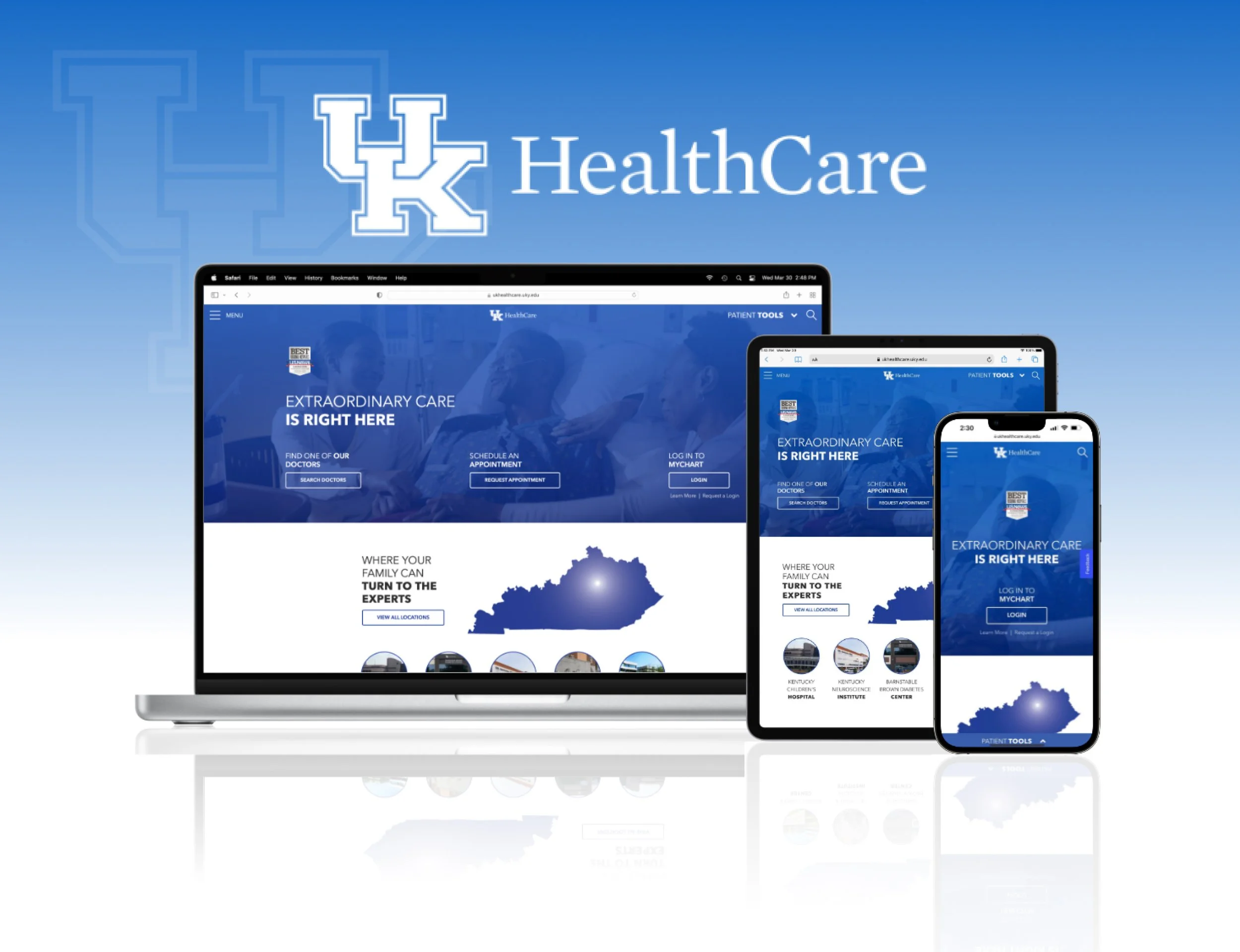
UK HealthCare
Translating the “power of advanced medicine” into a clear, accessible experience for patients and visitors.
Overview
The primary goal of the UK HealthCare website redesign was simple: help patients and visitors find the information they need, when they need it, with as little friction as possible. At the same time, the experience needed to bring “The Power of Advanced Medicine” to life. Not as a tagline, but as something users could feel through clarity, confidence, and trust.
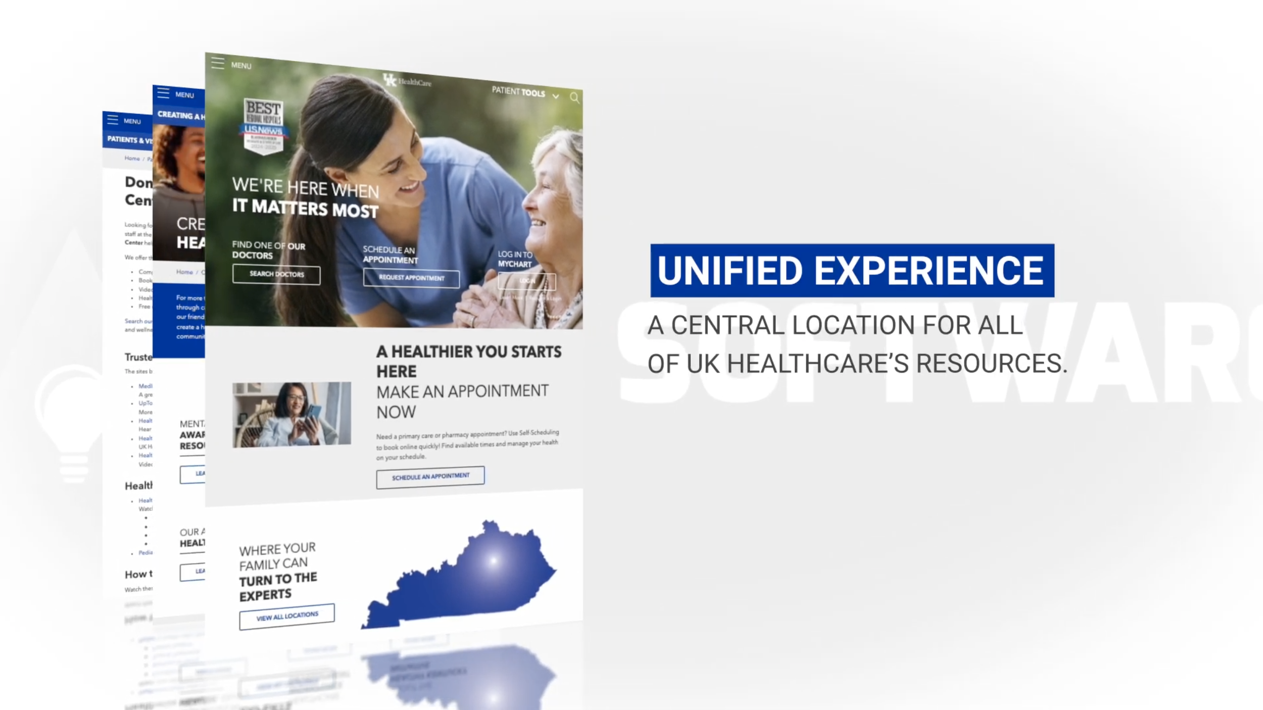
The result was an award-winning website that supports multiple layers of navigation without overwhelming users, introduces a powerful search experience across providers, conditions, and services, and provides a flexible content management system that empowers teams across the organization to manage content efficiently.
The Challenge
Over time, the UK HealthCare website had grown into a collection of loosely connected hospital and clinic sites. Each had its own content, stakeholders, and navigation, often functioning like independent websites rather than a unified system. As content and taxonomies expanded, maintaining consistency on both the front end and back end became increasingly difficult. The system was no longer scalable, and small updates often required significant effort.
Key challenges included:
Multiple hospitals and clinics, each with complex and overlapping content
Inconsistent design patterns across subdomains
Decentralized content management with little standardization
A rigid CMS that required custom, time-consuming solutions
An aging visual design that no longer reflected the brand
Discovery Phase
The new UK HealthCare experience needed to support a wide range of users and an enormous amount of content—from service lines and hospitals to providers, conditions, treatments, and articles. Designing a clear, usable experience across that complexity required a strong foundation in user research and a deep understanding of how content was created and maintained internally.
We began with a comprehensive discovery phase focused on building empathy across all user groups, including patients, visitors, stakeholders, and content managers. This helped us understand not just what users were looking for, but how they think, where they feel uncertainty, and what builds trust in a healthcare setting.
Secondary Research
-
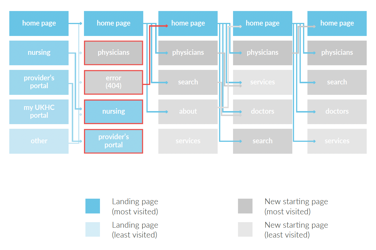
Using the Google analytics collected for the previous year on the site, we gained insight into user demographics, location, devices, acquisition and bounce rates, and user flow for the site for both desktop and mobile.
-
We implemented behavioral tracking on the existing site (Hotjar) to analyze demographics, heat maps, and user flows, distilling these findings by user type to inform persona development and journey mapping.
-
For our UX audit of the existing UK HealthCare website, we were looking for all of the features and interactions on the frontend of the site (both desktop and mobile) that we felt were needing the most attention to adhere to best practices and accessibility standards.
-
A surface-level visual competitive analysis was performed. In it, we looked for design features, interactions, user flows, and applied best practices of other large scale university-based healthcare systems’ websites. For each site we complied the pros and cons of the experience and used this to 1) familiarize ourselves in the industry space, 2) determine what experiences were most ubiquitous so as to design something that felt familiar, and 3) take the features and interactions we liked most as inspiration into our design phase.
primary research
-
After a brief, informal interview, participants were asked to complete a think-aloud usability session. A think-aloud session is an in-person qualitative research method where participants are given tasks to complete using the current website and asked to verbalize their thoughts as they navigate through the site. The moderator for these sessions remained as passive in their observations as possible. The sessions were also screen and audio-recorded.
-
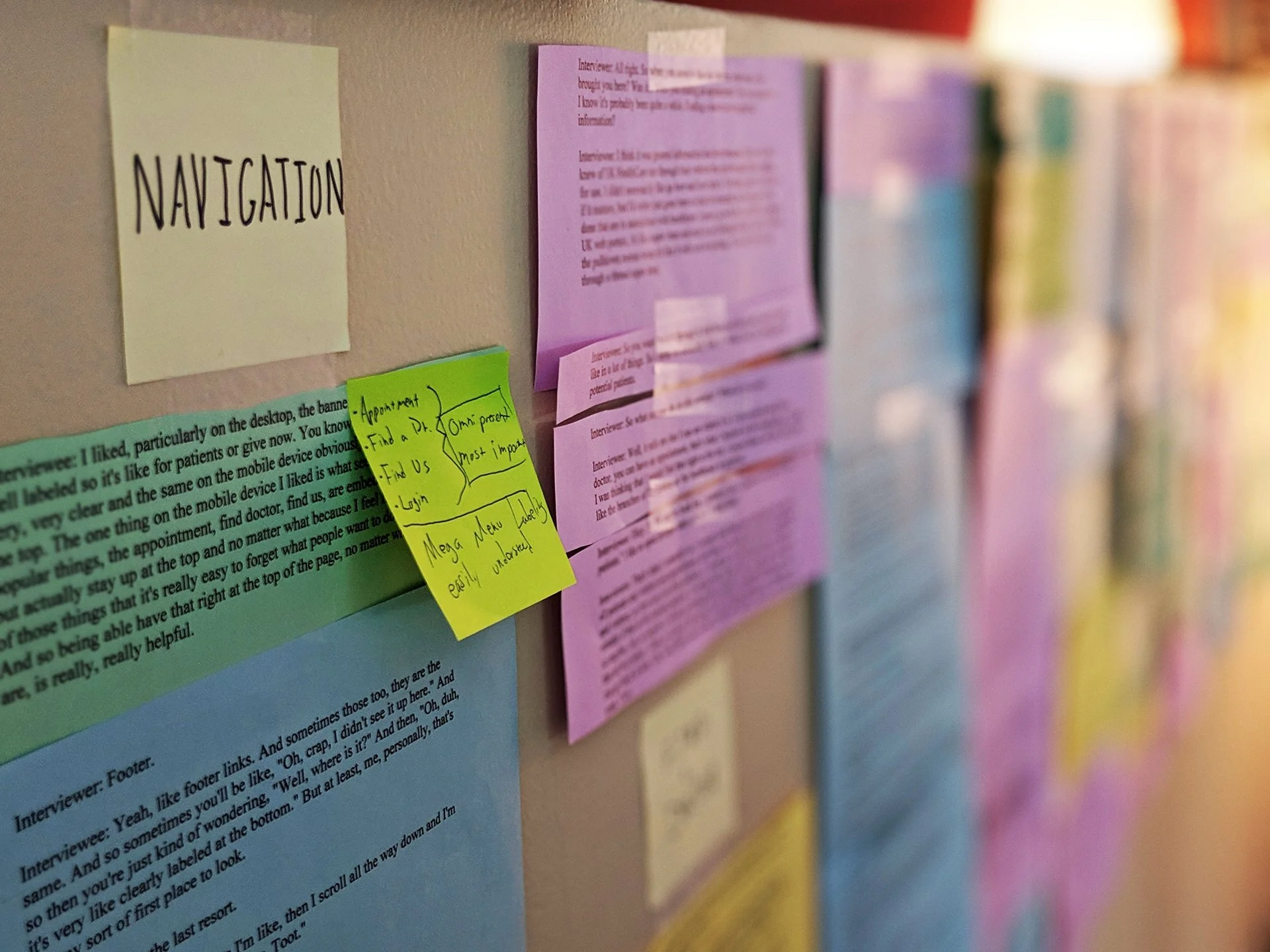
To properly analyze and extract insights from the recorded interview and think aloud sessions, transcriptions of the sessions were created. All quotes deemed valuable from the transcriptions were then consolidated and printed on color-coded paper based on user type. Individual excerpts were cut out and then organized based on topic into topical buckets defined as the researcher worked through the text. Lastly, insights were identified and written on post-it notes from these now labeled and organized excerpts.
-
The System Usability Scale provides a “quick and dirty” reliable tool for measuring the usability of a service, product or system. It consists of a ten-item questionnaire with five response options for respondents; from “Strongly agree” to “Strongly disagree.” It serves as a method to quantify a qualitative experience and can be used to grade current performance and/or create a baseline score from which to improve. Users were asked to complete the survey after their Think-Aloud sessions based on their experience during the session. These surveys were then scored and compiled to give an overall usability score.
-
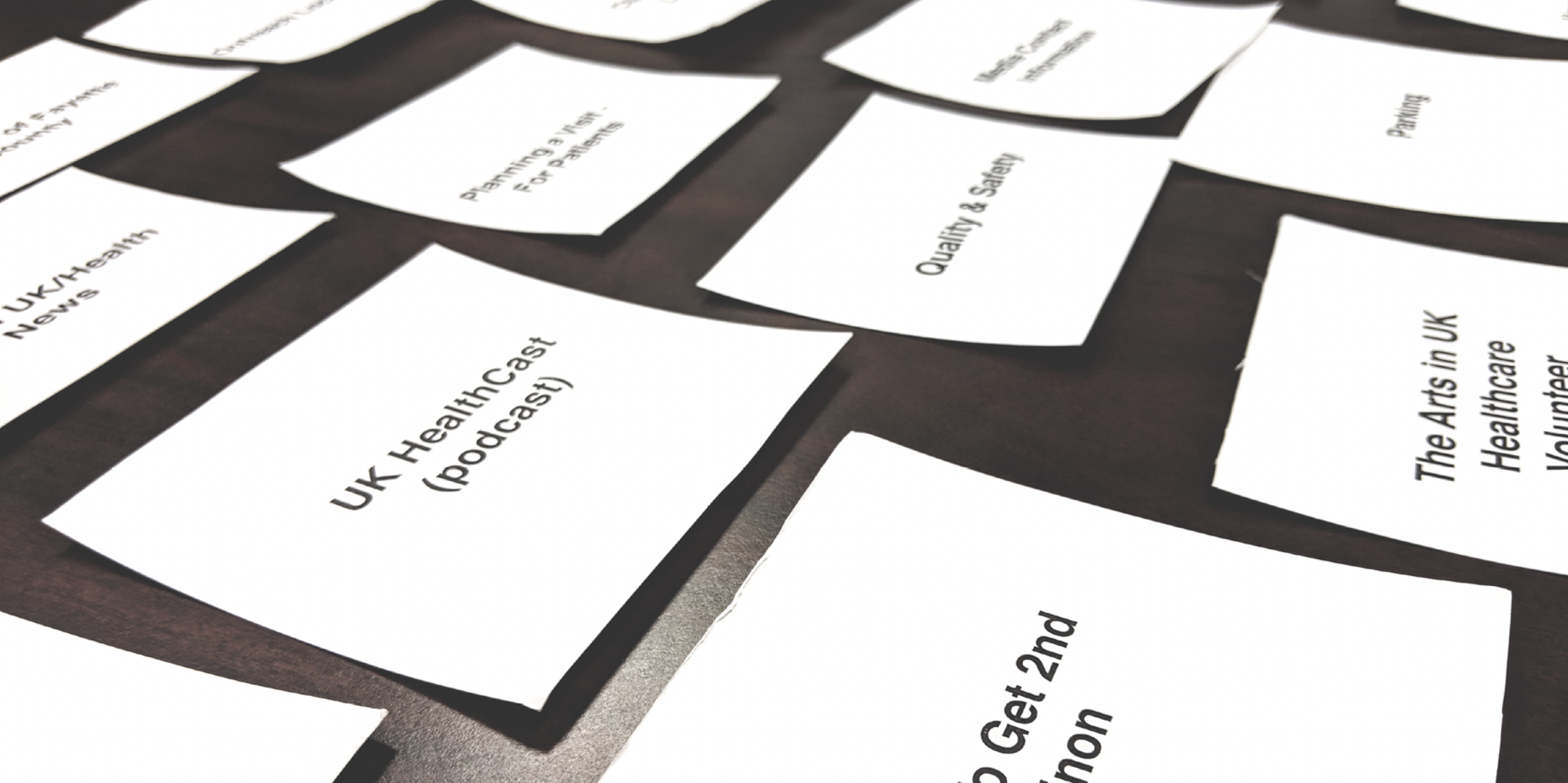
As part of our in-person interviews and usability testing, we also asked participants to take part in a card sorting exercise. Written on the cards (96 total) were all of the features, information, services and links offered on the current site. Participants were then asked to take an initial pass through the deck, setting aside any/all cards they felt would pertain to them in any capacity. After this, participants were asked to organize the cards they selected in order of importance to them.
User types and journeys
Using all of the insights gathered from our secondary and primary research, we quickly crafted high-level, lightweight personas and visualized their user journeys based on their circumstances, goals, needs, and the project goals.
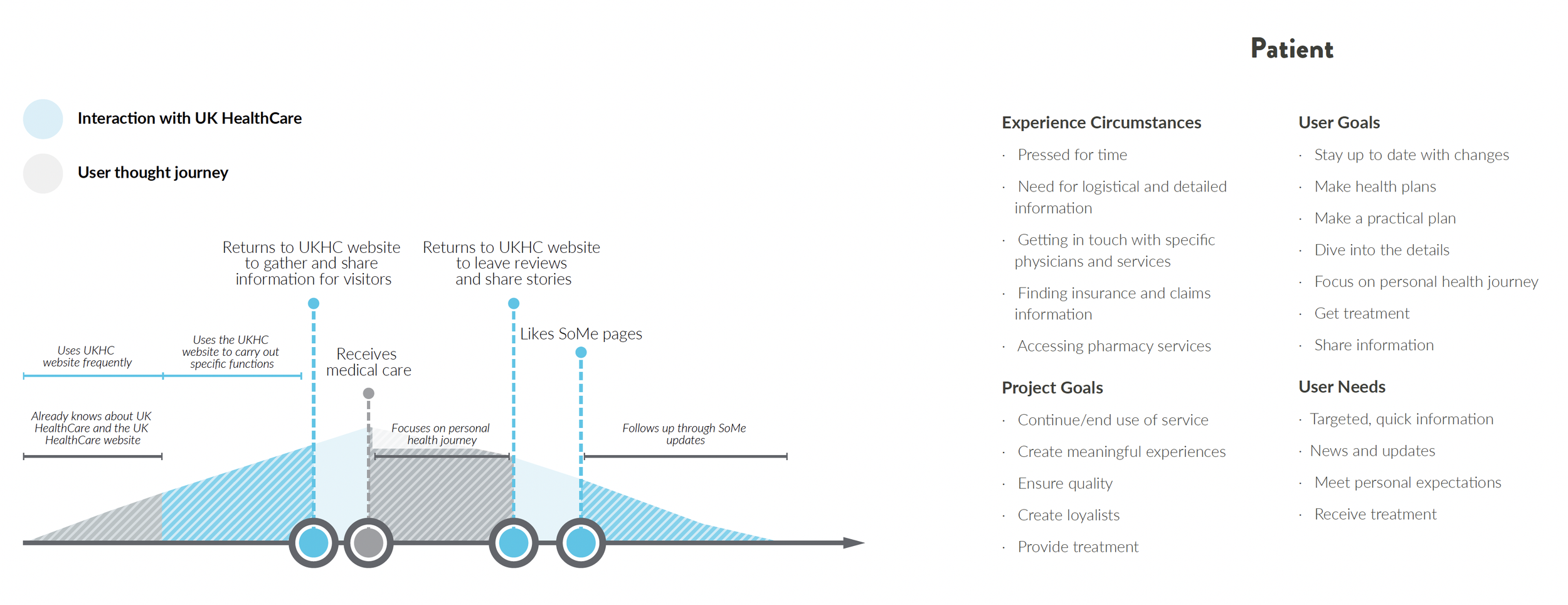
Discovery insights
Research consistently pointed to one core need: clear organization and intuitive navigation. Users relied heavily on way-finding to orient themselves, often needing multiple paths to reach the same information. In some cases, this meant designing up to four distinct navigation patterns on a single page, without adding confusion.
These insights directly informed the design of the site’s information architecture, navigation models, and search experience.
DESIGN Phase
Grounded in what we learned about patient and visitor needs, we designed the new site from the ground up - starting with a clear, intuitive sitemap and organizing content in ways that matched how people naturally look for care and information.
Information Architecture & Content MAPPING
A major challenge of the project was consolidating several large hospitals (each effectively a full website with its own content types, taxonomies, and navigation) into a cohesive system that still allowed each entity to retain its identity. Rather than forcing a one-size-fits-all structure, we mapped shared patterns across hospitals while accounting for their unique needs, content models, and service lines. This approach allowed hospital “subsites” to function independently where necessary, while still fitting cleanly within the broader UK HealthCare site architecture. The result was a scalable structure that supports complex, overlapping content without fragmenting the user experience.
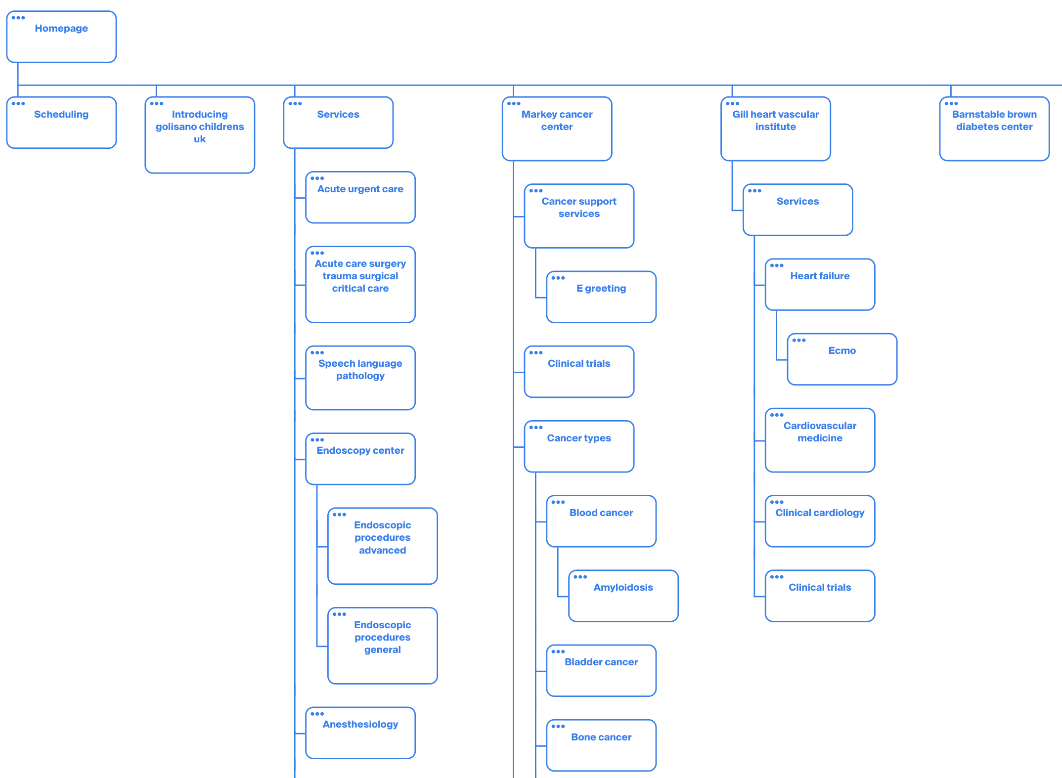
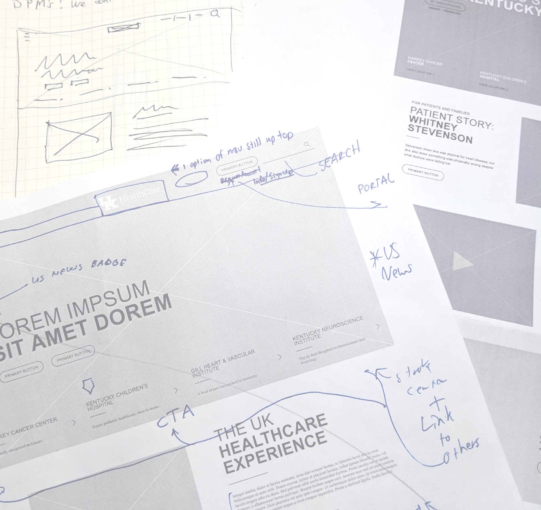
Wireframing
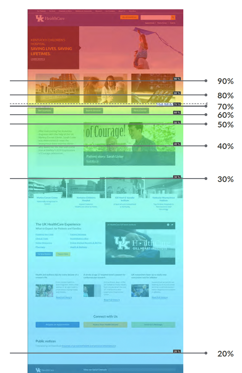
Using an iterative design process, we began with low-fidelity sketches and digital wireframes to organize content and establish hierarchy, then gradually increased fidelity across key page types. This approach allowed us to test navigation, layout, and way-finding early while accounting for the complexity of multiple hospitals, services, and content models. Wireframes became a shared tool for aligning teams and refining the experience before visual design began.
Featured Designs
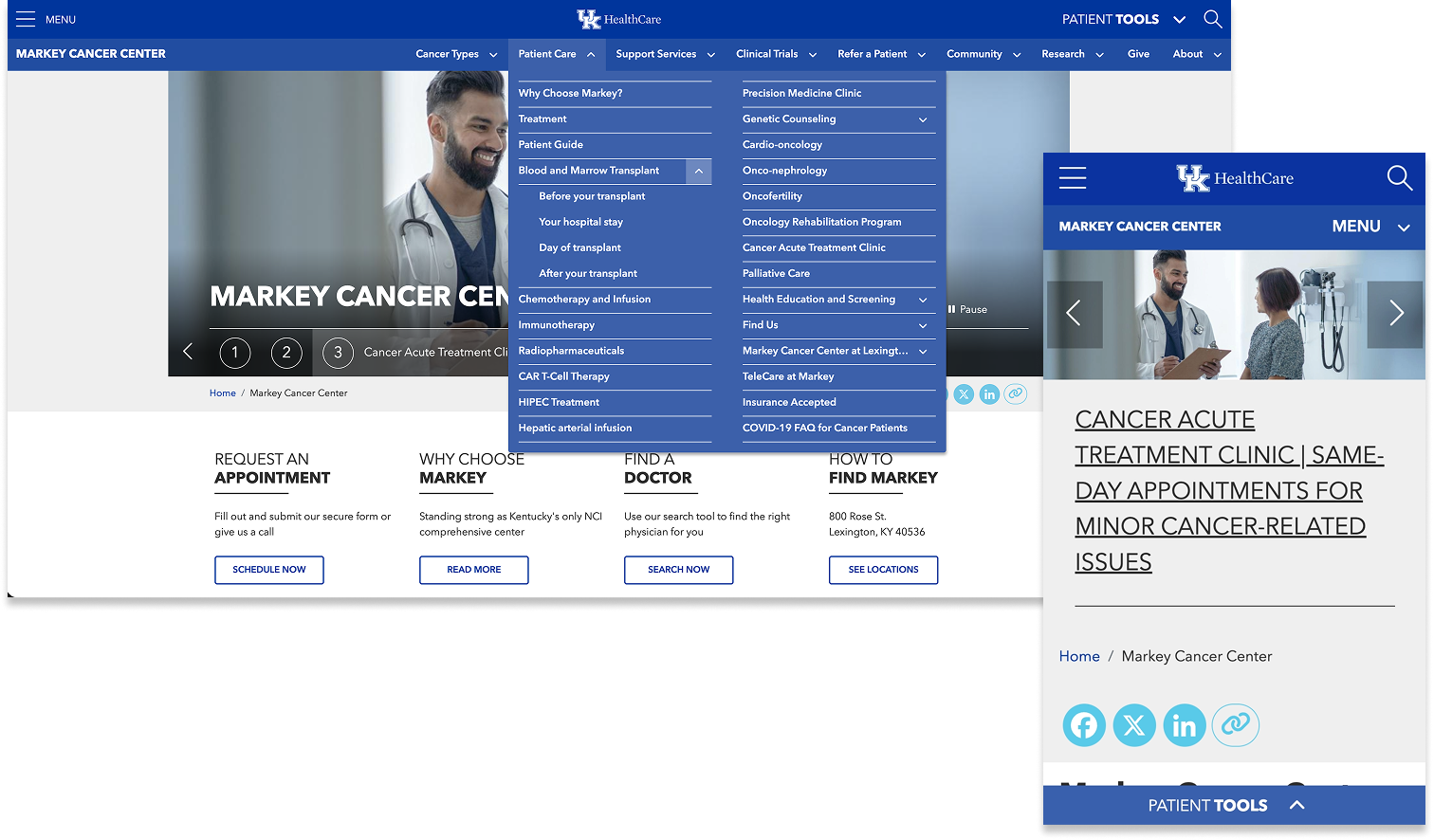
With dozens of hospitals, clinics, and service lines unified into a single experience, navigation required clear visual hierarchy to prevent users from feeling lost as they moved deeper into the site. We addressed this by designing a “layer cake” navigation model that uses distinct visual treatments (spacing, background color, typography, and alignment) to separate global, section-level, and local navigation. These layered cues make the structure of the site immediately legible, helping users understand their location and available paths at a glance, regardless of depth or complexity.
Multi-Level "Layer Cake" Site Navigation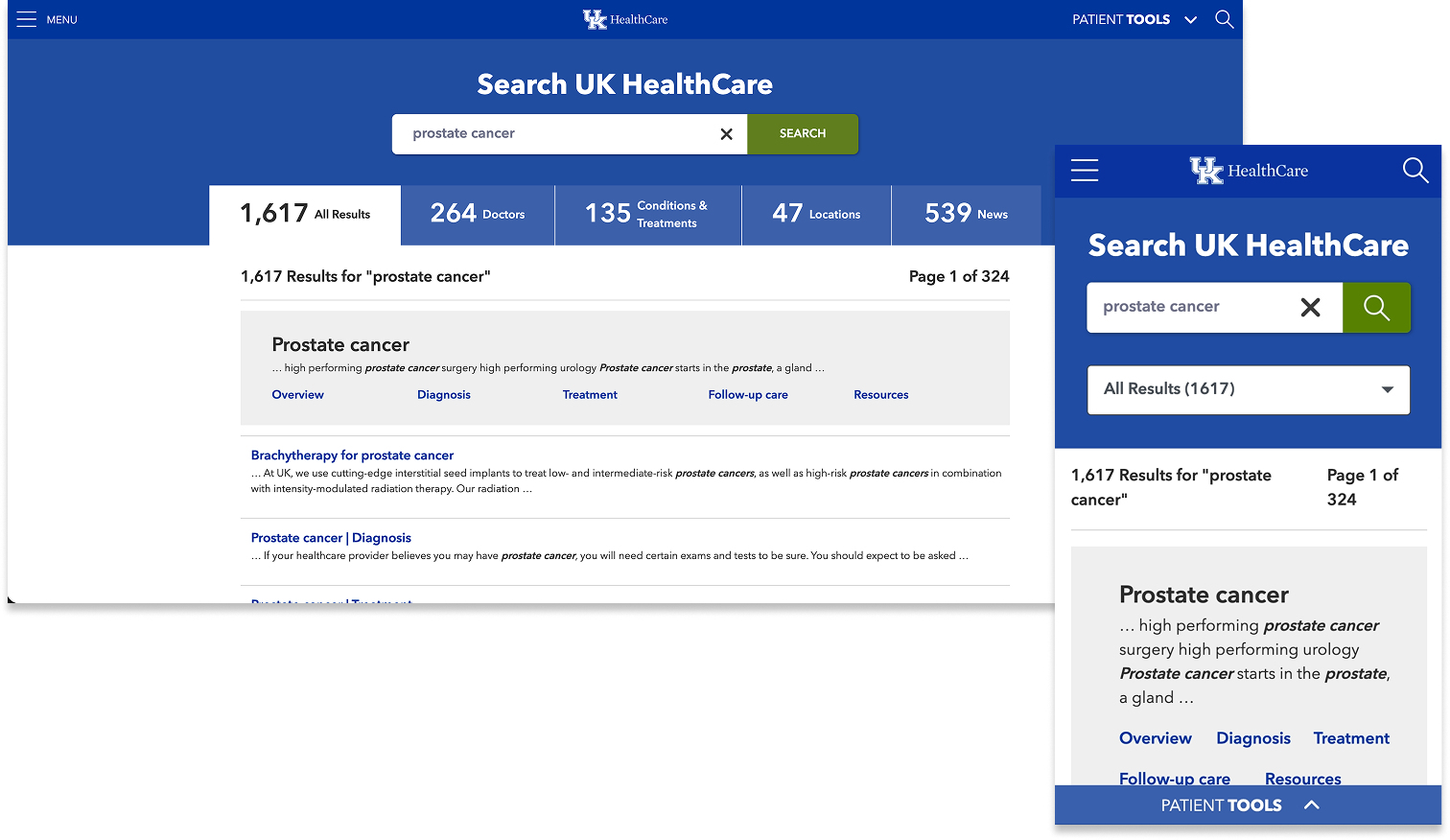
Search played a critical role in helping users navigate the scale and complexity of the UK HealthCare site, especially for patients and visitors arriving with a specific goal in mind. Rather than presenting a single, undifferentiated list of results, we designed a robust, content type–based search experience that groups results into clear categories such as providers, locations, services, conditions, and articles. This structure makes results easier to scan, compare, and refine, allowing users to quickly find what they need without understanding the site’s underlying organization.
Robust, Content Type-Based Search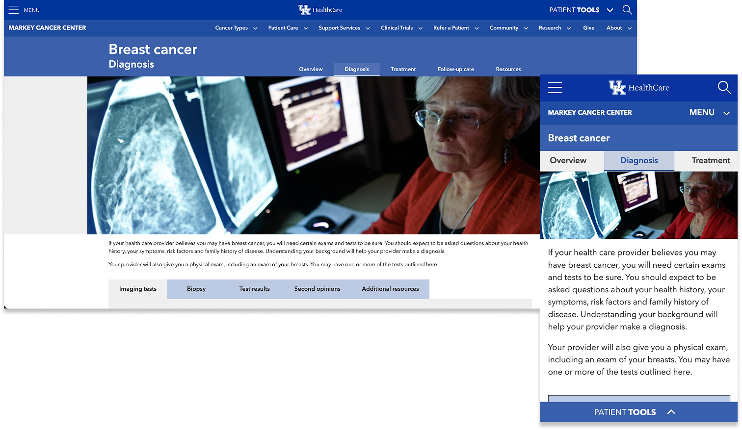
Patient journey designs were used throughout condition pages to help visitors navigate complex, highly detailed information with confidence. Nested content was thoughtfully organized across related pages, and custom tab components were introduced to group and surface relevant information without overwhelming users. These structures were informed by research and prioritized the topics patients told us mattered most (diagnosis, treatment options, tests, second opinions, and clinical trials) making it easier for visitors to understand their options and take the next step in their care.
Patient Journeyfinal product & accolades
The final experience delivered a modern, intuitive website that brings clarity to a large and complex healthcare system. A cohesive design system, layered navigation model, and content type–based search work together to help patients and visitors quickly find care, understand their options, and move forward with confidence.
The site launched smoothly and was immediately well received by patients, providers, and stakeholders for its clean visual design, improved usability, and thoughtful organization of information. Since launch, the work has been recognized by multiple web awards organizations, reinforcing the success of a patient-centered approach built to scale and evolve over time.

Lorem ipsum dolor sit amet, consectetur adipiscing elit, sed do eiusmod tempor incididunt ut labore et dolore magna aliqua. Eget velit aliquet sagittis id consectetur purus ut faucibus pulvinar. Commodo quis imperdiet massa tincidunt.